Gerencia RED
Branding
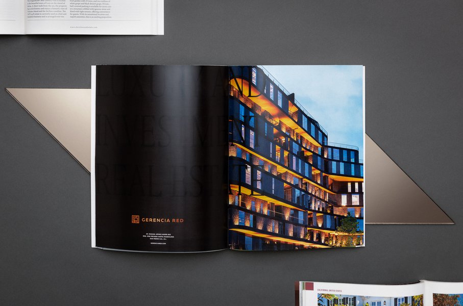
Brand identity for a local real estate company.
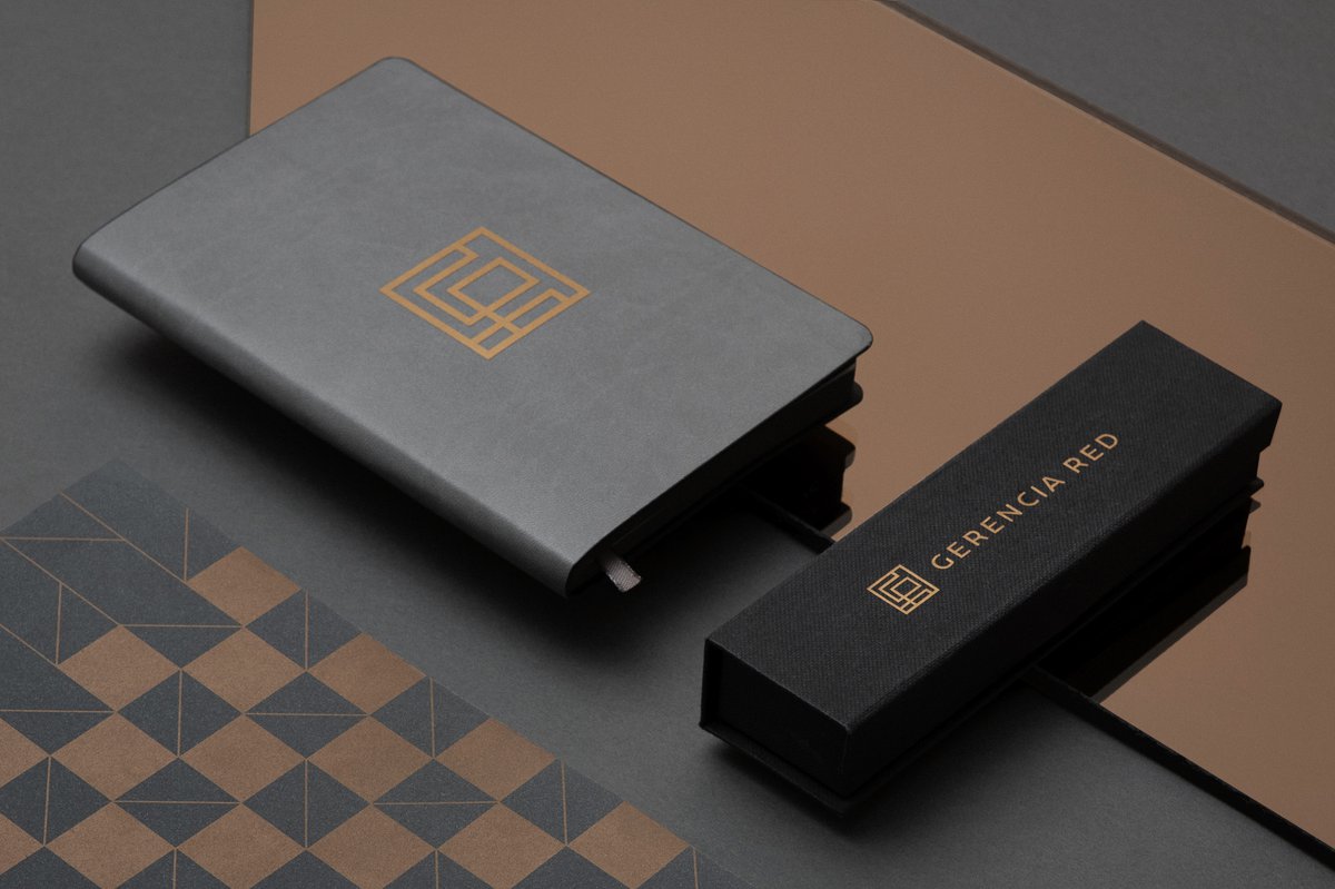
Gerencia RED, established in 2004 in San Pedro Garza García, N.L., Mexico, provides comprehensive real estate services and a single point of contact for luxury properties for sale or rent. In 2006 they joined forces with Christie's International Real Estate, a subsidiary of the oldest auction house in the world that is identified and recognized as synonymous with excellence, trust and satisfaction. Later in 2019, it was decided to have a brand makeover.
For this project, the goal was to design and reflect on the level and growth of the company and position it as the leading real estate company in northern Mexico with the highest quality.
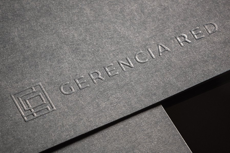
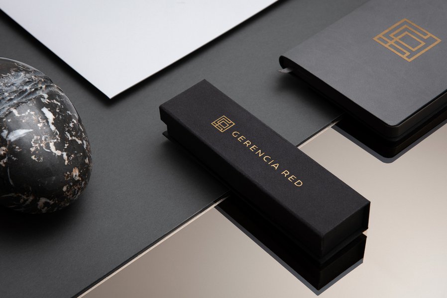
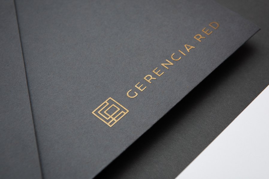
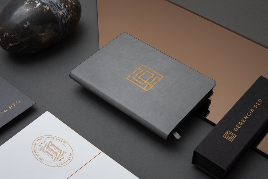
With this in mind, we decided to completely renew its image with a clean, elegant and prestigious design. We changed the orange color to a copper tone to give it more sophistication, accompanied by a typographic contrast between serif and sans serif that combined all the elements to create something simple and modern with a touch of class.
The emblem visualizes the G and R in an architectural plan as a reference to their listings to create a clean, elegant and functional look.
We decided to completely renew its image with a clean, elegant and prestigious design.