Terramex
Branding
Brand identity for a local company of transportation and logistic services.

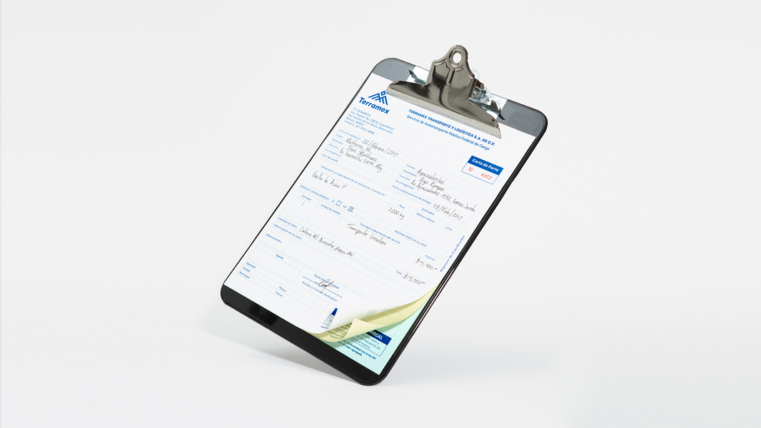
Terramex is a company founded in Monterrey, Nuevo León, dedicated to transportation and logistic services for various industrial sectors.
For the concept, the objective was to strive for a strong corporate image and timeless branding.
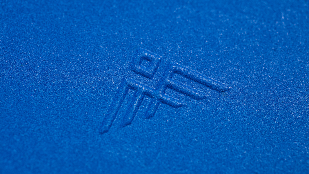
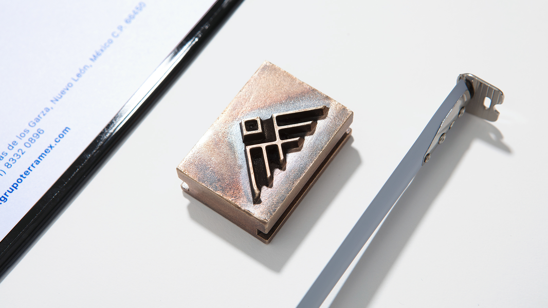
Another main goal was to present an image that complied with the abstraction of the following representations:
1 – The Eagle: symbolizing rapidness, precision and strength.
2 - Mountains: representing growth and the company’s origins and ties to the city where it was founded. (Monterey a city surrounded by mountains).
3 – Abstraction of ‘TMX’ which stands for Terramex, as the pillars of the emblem.
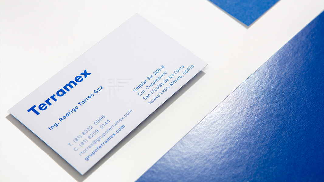
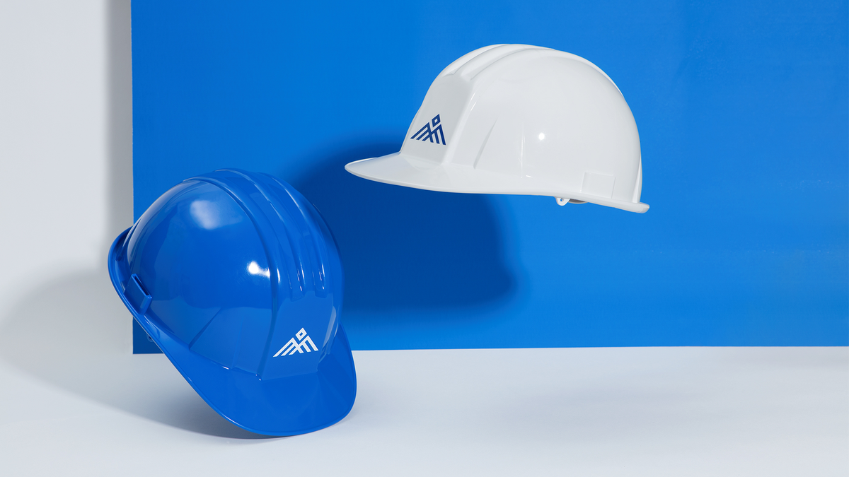
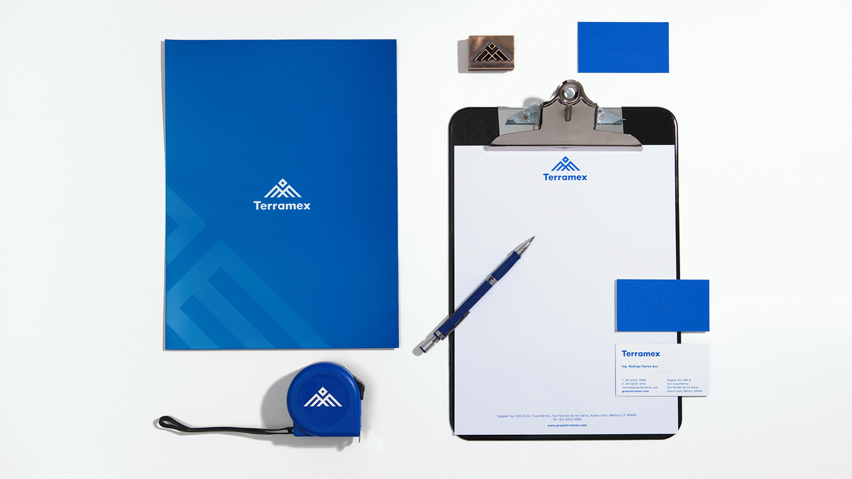
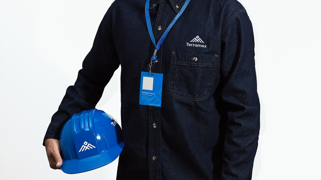
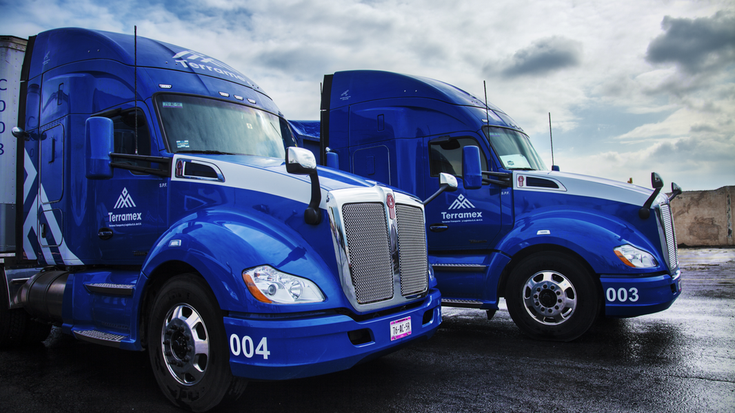
Once the branding had been defined, special attention was given to Terramex’s blue color to distinguish from the competitors, and a scale of grays and special finishing touches such as raising and UV barnishes were added. The typography reflects modernity and formality at the same time.
The branding reflects a very complete, strong and timeless image.
The branding reflects a very complete, strong and timeless image.